top of page
TANVI MEHTA
SPARSH
2024
"Sparsh" serves as my Master's project, emphasizing design for social change. The initiative crafts sensory solutions tailored for toddlers with sensory processing disorder by integrating chroma-therapy principles with tactile innovations. Informed by interdisciplinary collaborations, the products aim to create a calming and supportive environment, ultimately enhancing the well-being of children on the spectrum.


The brand print draws inspiration from the standout swatch: the sponge. Celebrated as the most effective among the curated collection of six, this swatch dazzles with its symmetry and the subtle green, perfectly aligning with the final brand colour palette.
The brand print draws inspiration from the standout swatch: the sponge. Celebrated as the most effective among the curated collection of six, this swatch dazzles with its symmetry and the subtle green, perfectly aligning with the final brand colour palette.
The brand print draws inspiration from the standout swatch: the sponge. Celebrated as the most effective among the curated collection of six, this swatch dazzles with its symmetry and the subtle green, perfectly aligning with the final brand colour palette.

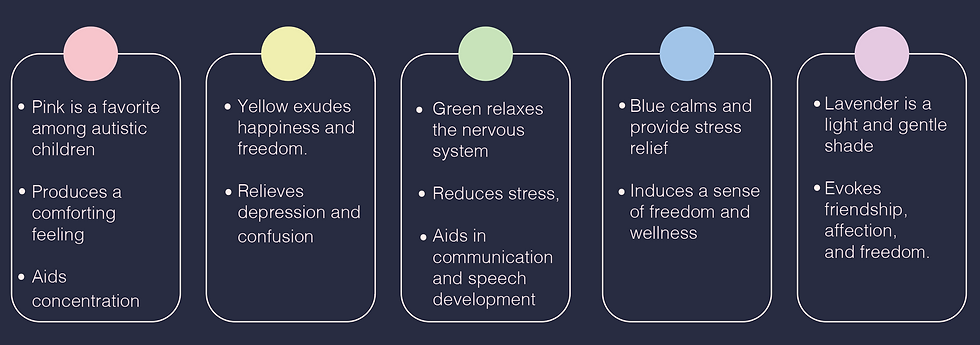


For the final products of the brand Sparsh, I selected a pillow and a rug—essentials in any homeware collection, especially in households with toddlers. Both products feature the most effective swatch, the sponge, known for its soothing and engaging texture and pattern. This choice ensures that the designs not only integrate seamlessly into everyday living spaces but also cater specifically to the sensory needs of young children.


For the final product packaging, I aimed for a sustainable aesthetic that incorporates accents of the brand print for a cohesive look. To achieve this, I chose brown packaging made from recycled paper embedded with plant seeds. This not only emphasizes our commitment to sustainability but also seamlessly integrates our distinctive brand design, allowing our packaging to give back to the environment.
For the final product packaging, I aimed for a sustainable aesthetic that incorporates accents of the brand print for a cohesive look. To achieve this, I chose brown packaging made from recycled paper embedded with plant seeds. This not only emphasizes our commitment to sustainability but also seamlessly integrates our distinctive brand design, allowing our packaging to give back to the environment.

bottom of page